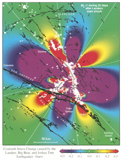
Figure 8. This startling figure shows that aftershocks preferentially occurred where the Coulomb stress was calculated to have risen (red zones) and are scarce where the Coulomb stress dropped (purple zones). Credit: King et al. (1994)
Latest posts by Rachel Crowell (see all)