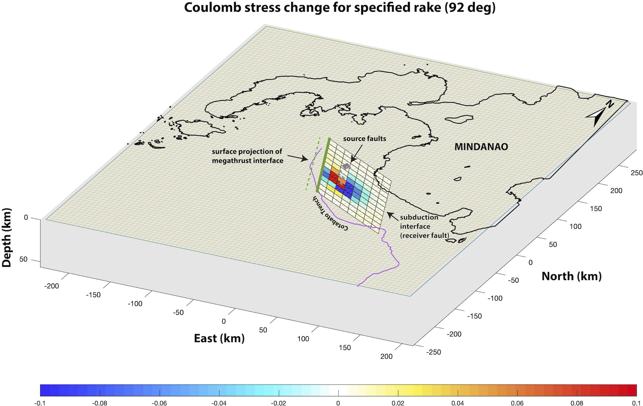
Figure 4. The Coulomb stress transfer model illustrates how the recent earthquake swarm may have altered stress along the subduction interface. Areas shown in red represent increased stress, whereas areas in blue represent decreased stress. The thick green line at the top of the fault plane indicates the top of the rupture of the 1976 earthquake, which we used to constrain the receiver fault plane. Credit: Llamas et al., 2026, CC BY-NC-ND 4.0
Alka Tripathy-Lang is a freelance science writer based in Chandler, Arizona, and holds a Ph.D. in geoscience.
Latest posts by Alka Tripathy-Lang, Ph.D. (see all)
- Living through the Loma Prieta earthquake - October 21, 2021
- The Great Quake Debate: an interview with seismologist and author Susan Hough - August 27, 2020
- Salton Sea Swarm quiets down - August 12, 2020