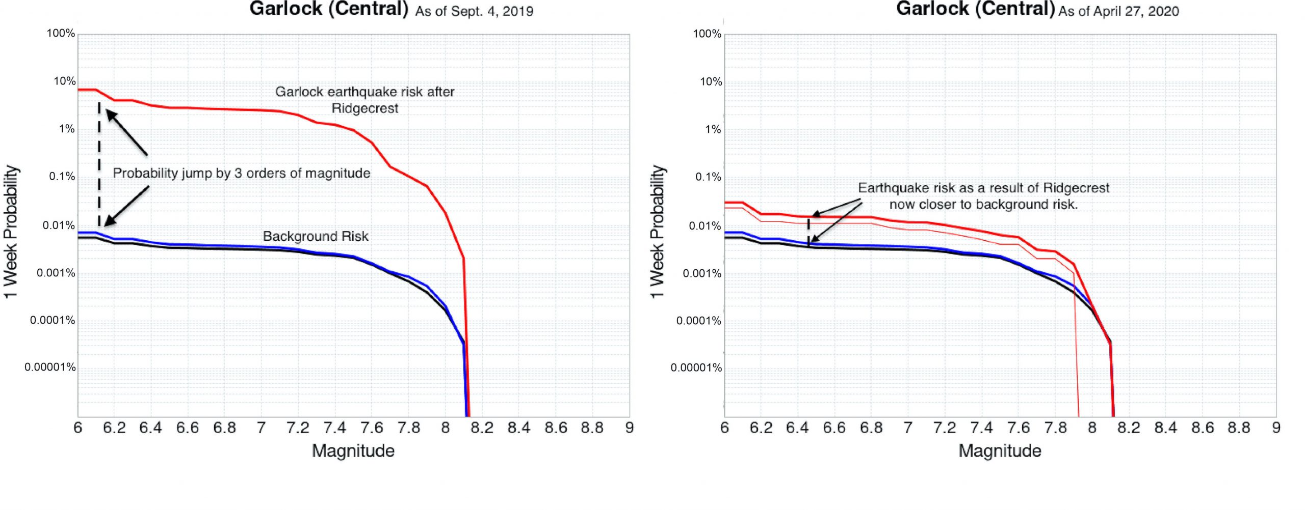
Garlock fault rupture forecasts over a 1-week interval. The black lines represent long-term background risk, blue lines represent the risk on these faults as time goes on, and the red lines generated by the new model add the Ridgecrest events onto these two lines, thus showing the most up to date risk with all events included. These two charts are separated by 7 months, clearly showing the Garlock settling back into its background, or time-independent, risk. Credit: Kevin Milner
Latest posts by Jen Schmidt (see all)
- M 6.6 earthquake offshore Crete - May 2, 2020