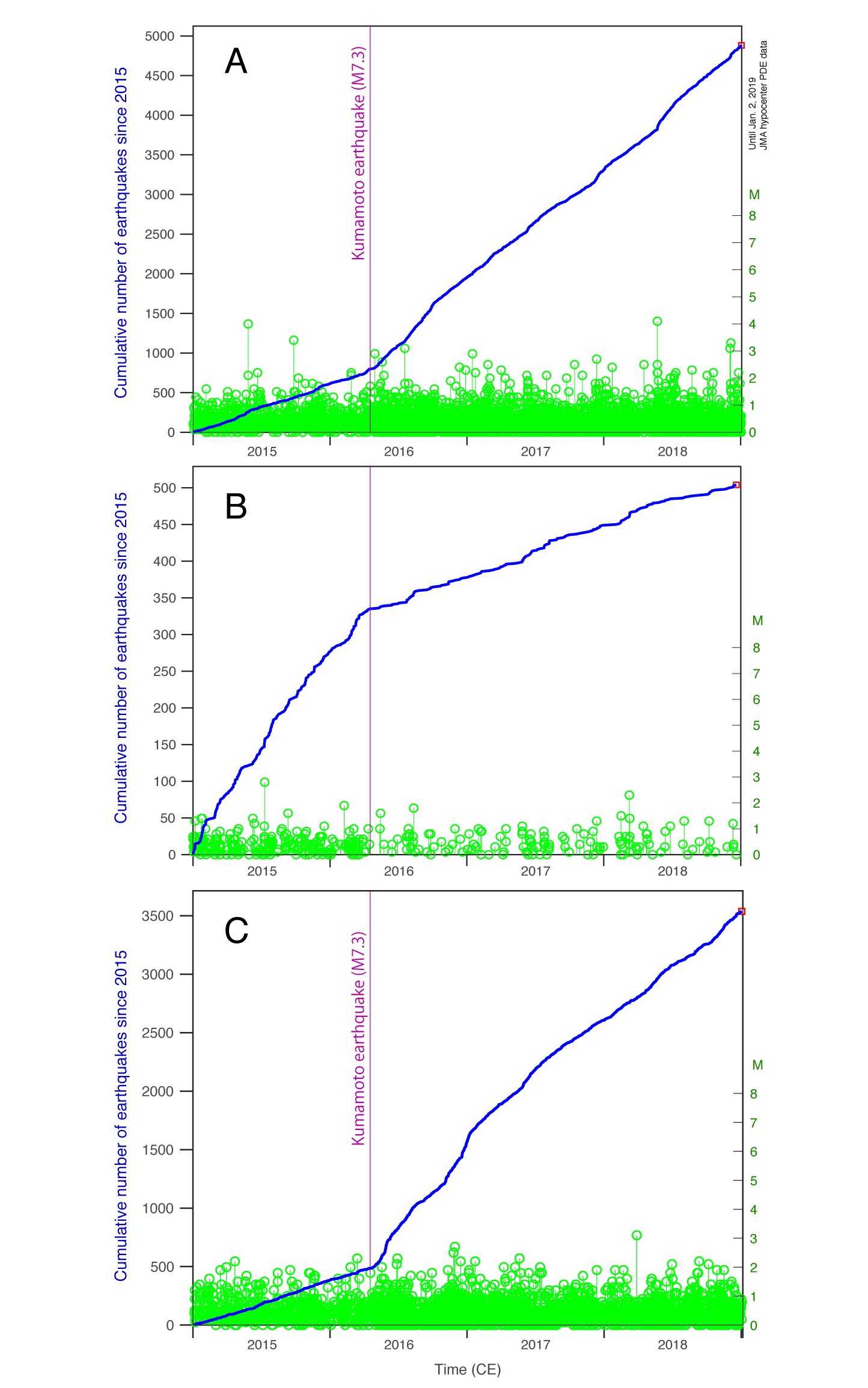
Figure 4. Seismic time series in the particular sub-regions, A, B, and C, corresponding to the boxes in Fig. 2 left panel and Fig. 3. The blue line indicates cumulative number of earthquakes since 2015 (with the corresponding blue scale at left), whereas the green stems identify each earthquake time and magnitude (green scale at right). What’s clear is that in all cases, the seismicity rates changed roughly at the time of the 2016 Kumamoto mainshock, and in the manner forecast by the Coulomb stress changes.
Latest posts by Temblor (see all)
- Beware quiet segments of the Philippine Fault - May 16, 2025
-
ډیری عوامل افغاني ټولنې د زلزلې پر وړاندې زیانمنوي
- August 11, 2022 - What’s happening this week in Humboldt County, California: The squeeze - February 6, 2019